Gender Spectrum Briefing
Nike Kids Footwear
When I started working in kids footwear, the briefs I received were hyper-gendered. Colour direction was split cleanly between boys and girls, with little room for nuance. But I was curious. Did kids actually think about colour and gender the way we were designing for them? So I started asking…
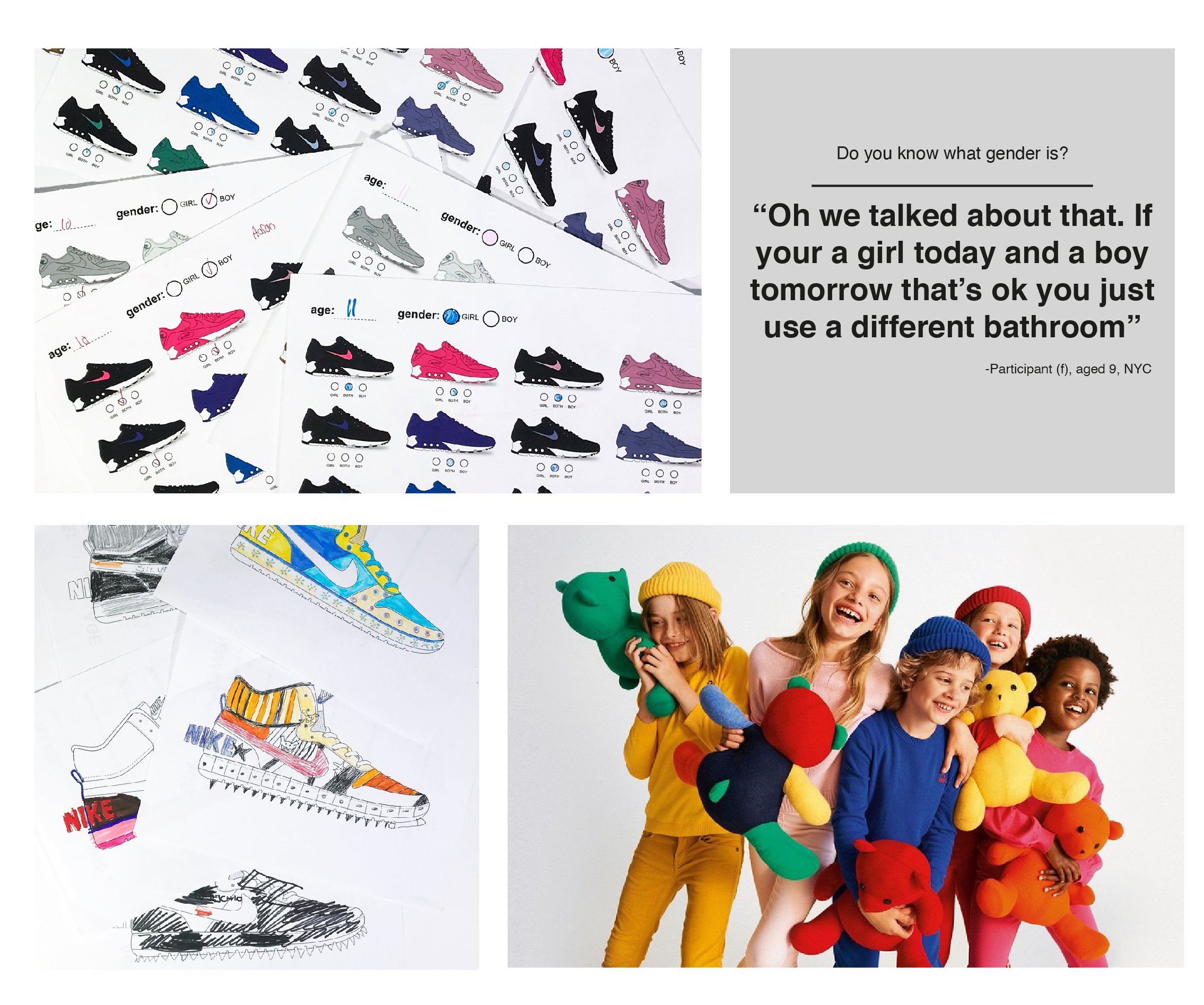
I began interviewing kids about gender and whether it had any influence on the colours they wore. What I found didn't fit the binary system we were designing for. Kids fell roughly into three patterns.
Some were gender conforming. They liked what was assigned to them and felt comfortable there.
Some played with gender. Today they'd dress girly, tomorrow they'd be a tomboy. It was fluid and situational.
And some wanted access to what was assigned to the other gender. Boys wanted shiny things. Girls were shopping in the boys’ section because they loved the colours more, or felt the girls’ selection was too narrowly "girl."
So I designed a new one.
I created a briefing framework that put gender on a spectrum instead of a binary. Rather than briefing packs as "boys" or "girls," the tool helped the team find the edges. Where could we push? Where could we create more variety? Where were we missing opportunities to connect with kids who didn't fit neatly into one category?
The spectrum approach didn't eliminate gendered product. It expanded the range of what was possible within it. It gave the team permission to explore and a structure for doing it.
THE FOCUS
We decided to start with girls colourways. Girls, especially at the beginning of the project, were the ones pushing back most vocally on what we'd been providing. More of them were telling us they wanted something else. As the project evolved, more boys started expressing the same thing, playing with their gender when they got dressed. But girls felt like the safest space to begin redefining what was possible.
One of the big takeaways was that girls didn't want to be talked down to in their products. The grade school age group, roughly 8 to 12, wanted to feel cool. At the time, women's product was moving in a more playful, brighter direction than previous trends, and we were trying to define what "cool" looked like for kids specifically. Something that didn't speak down to them, but also didn't collide with what the women's team was doing.
I picked three projects to showcase how this thinking came to life.

WINTER WARM
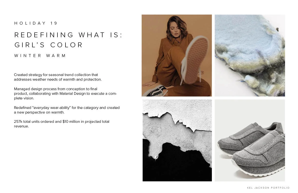
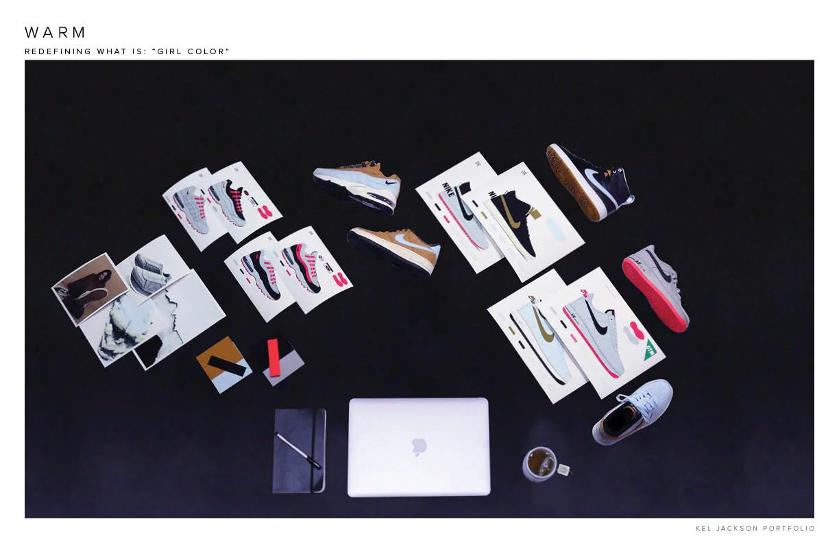
This was the project that proved the new briefing approach could work. We always had to do a winter project for December, and we used it as a space to be more experimental.
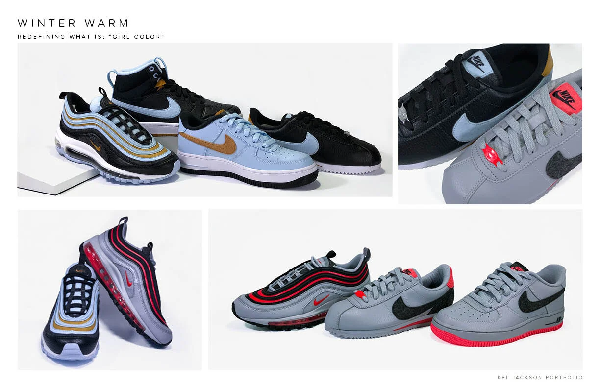
The concept was built on juxtaposition. We took what we were learning through briefing conversations and insight collection about the aesthetics of gender, and played with contrast. Soft but durable textiles paired with tactility. One colourway that felt traditionally masculine: black, grey, and red. Another that felt softer and more feminine but wasn't hitting you over the head: light blue and gold.
The result felt genuinely unisex. And that became a bigger unlock than we expected. In kids footwear, you generally use the same last across both girls and boys, especially in younger sizes. There were very few reasons other than tradition and planning that we couldn't offer more unisex product. This project gave us the leverage to successfully lobby for more unisex offerings across the line.
PRETTY FIERCE
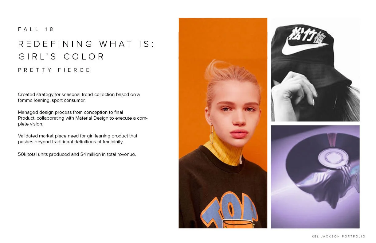
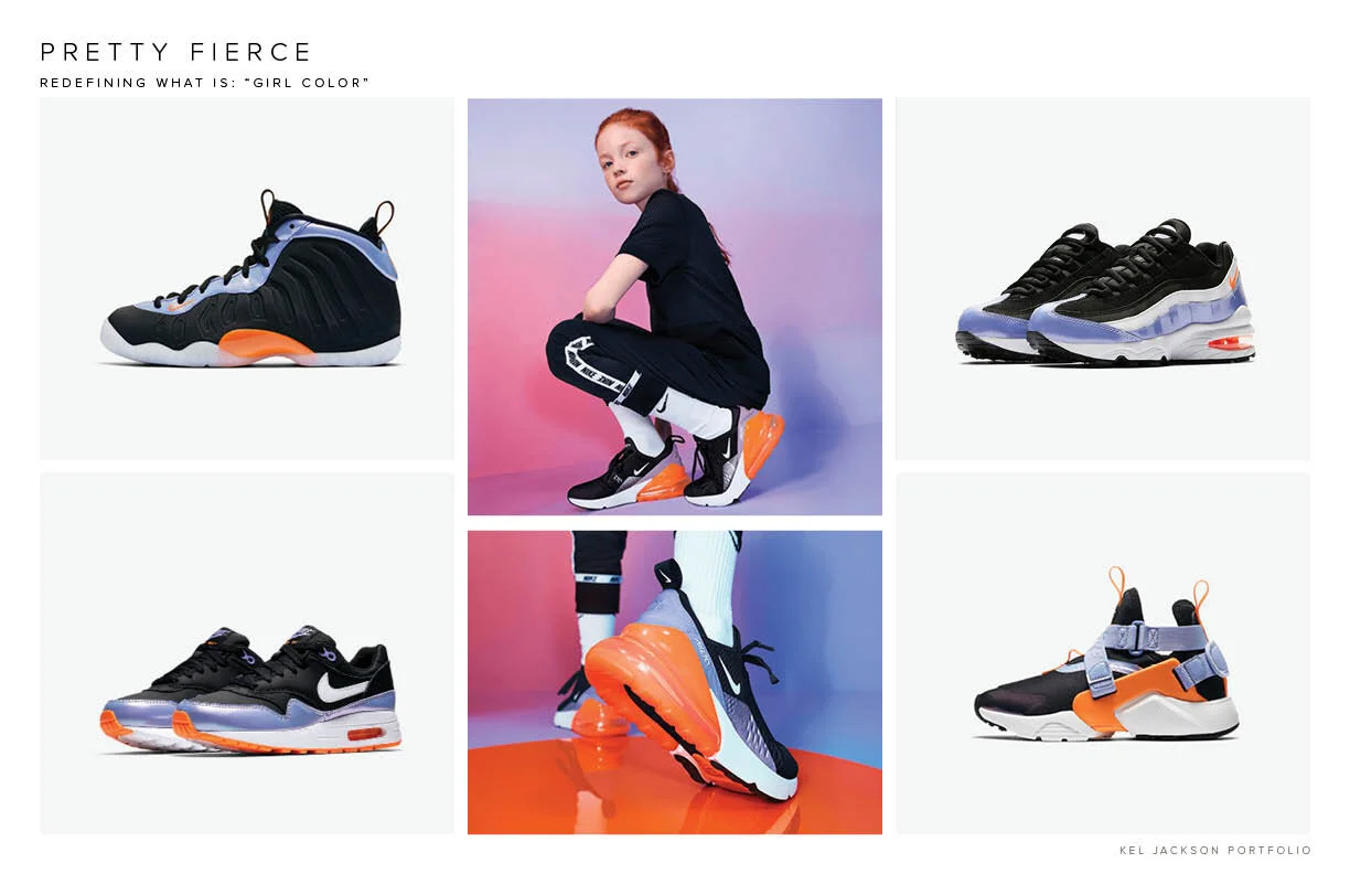
This project locked into what feels playful, fun, young, and feminine without talking down to the girl consumer.
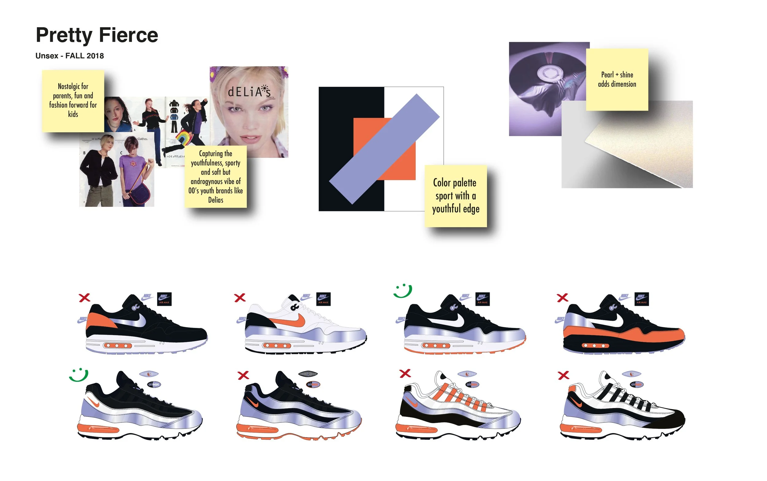
It was inspired by the Y2K trend that was just starting to surface. I went back through old Delia's catalogues and pulled from that energy of bright, unexpected colour pairings. Bright orange plus purple, with a bit of pearlescence on the purple to make it feel feminine but cool, a little edgy. Black added an edge. We experimented with pushing it darker and more aggressive, then pulled back and balanced it to feel timeless. Almost vintage, but also futuristic.
This project gave us leverage to bring more fashion-forward, trend-forward storytelling to girls colourways and helped evolve what our partners expected from us when it came to designing for girls.
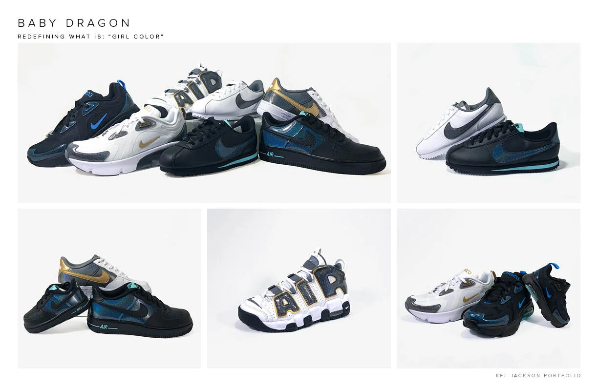
BB DRAGON
Every season we were asked to provide something specifically for very young kids. The challenge was always the same: it needed to be fun and irreverent, but we were boxed in by safety standards. Nothing that could be pulled off and put in a baby's mouth. Wear testing was more extreme. The constraints were real.
This project also came from trend forecasting and insight gathering around parents and toddlers. A lot of parents wanted a mini-me look, which often created tension with the women's team because they wanted their colourways to stand on their own rather than being copied and pasted down to toddler sizes.
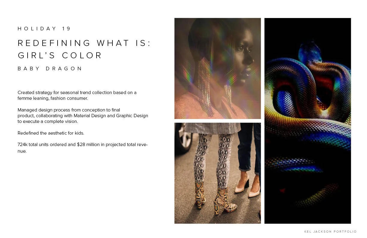
At the time, snakeskin was a huge trend and the women's team was exploring it in a variety of ways. We wanted something that tapped into that energy but felt young, interesting, and fun. Cute without talking down to the consumer.
BB Dragon was initially intended for baby and toddler only. It became so successful that it was adopted across every age group and across a wide variety of sneaker models.

The new briefing language opened up deeper conversations about the aesthetics of gender across the team. It inspired marketing and merchandising partners to think differently about how product was categorised and presented to consumers.
This work became the foundation for my PhD research at the Royal College of Art, where I expanded these questions across the sneaker industry and developed the Gender-Expansive Colour Design Process Model, a framework that helps designers examine the assumptions built into their own processes.